As I’ve continued on this self-publishing journey, I’ve begun to really understand why it takes a whole team to efficiently publish a book. Sure, anyone can upload to Amazon with a Canva cover, but I’m trying to make this debut novel look as professional as possible… and boy, is it a lot of work.
Following my larger story edits, I sent the final draft to my beta reader, who is a friend I trusted to give honest feedback about the overall story. As he looked for plot holes and any remaining glaring grammar errors, I continued with my final line edits. Once I finished that grueling process, I was able to finally move on to the next step: Formatting. This stage of self-publishing Sirens was an endeavor that I felt warranted its own blog post.
Formatting
I was excited about and dreading this step since it was completely out of my element. I’ve been reading, writing, and editing since I was in elementary school, but finding what is visually appealing is a whole different ballpark (and one I have not historically been good at). As I went into this phase, I had no idea what was required, and despite the dozens of books I read a year, I soon realized how infrequently I critically looked at the formatting of what I was reading.
So this process started with a lot of research. I flipped through books from my bookshelf and Googled until I realized that I needed to add several pages to my manuscript, including a title page, copyright page, disclaimer page, dedication page, as well as a section for acknowledgments and an author bio.
These are additional elements of the book that hadn’t even crossed my mind while I was writing, but they were fairly easy to put together. The acknowledgments were perhaps my biggest challenge, as I wanted them to be perfect for the people who helped me throughout the process. The dedication and disclaimer pages were easily written in about ten minutes since they were a collective three sentences. The author bio was fortunately easy to put together from a tweaked version of the recycled bio I had already posted on this site. Finally, the copyright page fortunately came with both of the formatting options I tried.
So let’s talk a little more about those options.
Reedsy
As I’ve said before, I went through Reedsy for editing, and while that was a very expensive process, I had heard on TikTok that formatting on this platform was free. So, hoping to cut some corners, I tried it out.
For the most part (and for it being completely free to use) it was pretty slick. After uploading my manuscript, Reedsy broke up the chapters almost exactly as it was formatted in my Word document. I could then choose from three templates depending on the tone I was trying to set for my story. As promised, the copyright page was a natural staple for all available templates.

However, Reedsy had some limitations that made me choose not to use this platform. For one, the templates did not exactly fit the vibe I was going for with my story, which isn’t surprising considering you are limited to only three options to choose from. In addition to this, some of the other elements of the Reedsy templates were clunky, like getting rid of the table of contents and formatting the dedication page.
The Dealbreaker
However, what made me abandon the idea of using Reedsy was the fact that I could not edit the headers that were naturally assigned to my story. While the right page had a Sirens header, which I liked, the left side was given the chapter title instead of my name. My chapters, however, are not titled; they are just chapter numbers, which means the left pages had a chapter number centered in the header and a page number in the footer. Obviously, this would be confusing for readers as they try to determine where they’re at in the book, and when I asked if there was a way around it, a Reedsy representative told me there was no other option or way to fix this.
I considered working around it and titling my chapters even if it was just as simple as renaming it “Chapter 3,” for instance. However, given that I felt strongly about this project, I decided to forgo Reedsy even if it was free and convenient. Instead, I chose to spend the money I already anticipated having to pay on formatting.
If these drawbacks don’t bother you, though, or you have creative chapter titles, this might be a great free option! It is a good resource if you’re hoping to stick to a strict budget; it just didn’t work for what I had in mind.
Atticus
This one is not so budget-friendly, but it is ultimately the one I decided to go with to do the formatting of my book the way I envisioned.
Atticus is a formatting platform that you can also write your book on. It provided multiple template options and was recommended by Travis Baldree, who I look up to when it comes to self-publishing success. So, I decided to take advantage of their 30-day money-back guarantee and try it out.
Atticus is $147, and it ultimately worked for me. It lets you customize your template to fit exactly the criteria you’re looking for. You can also add pictures to the start of your chapters, which was a cool option (I didn’t need it for my book, but I thought it was worth mentioning!).
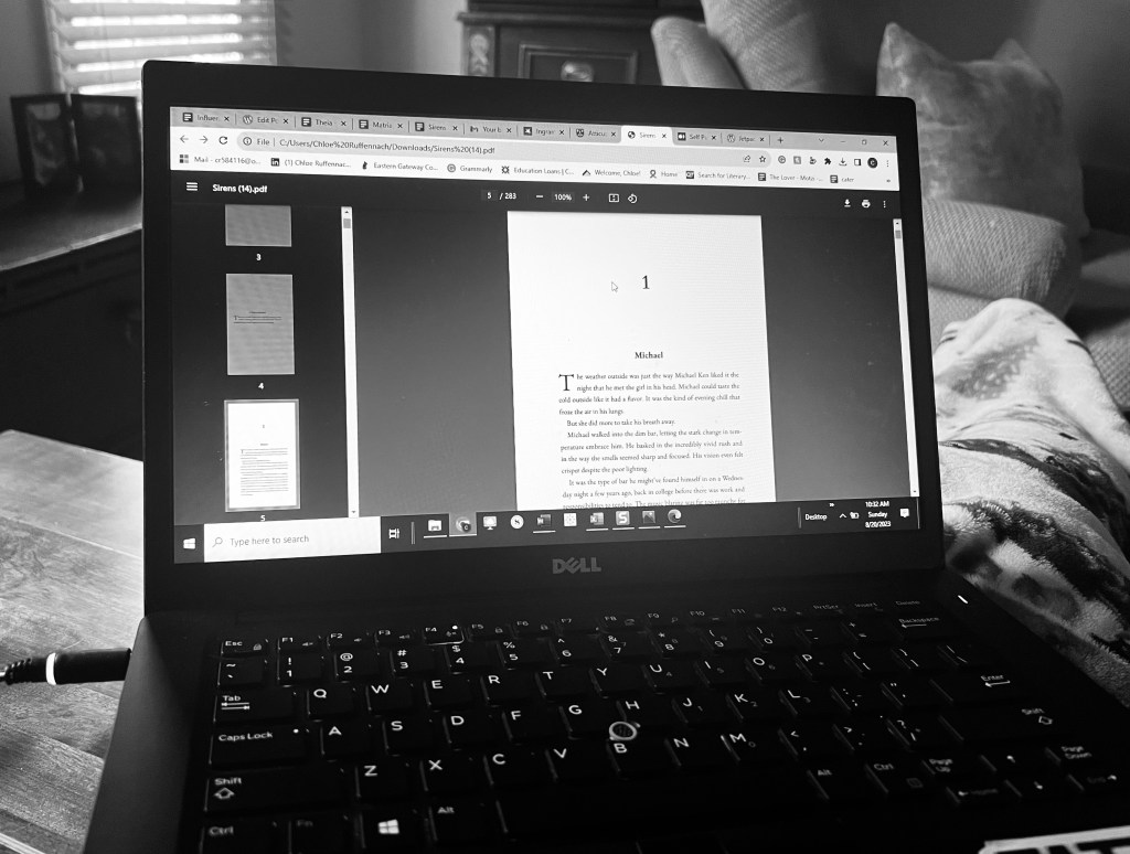
The frustrating part about Atticus is that when I uploaded Sirens, it did not read my document as accurately as Reedsy did. Atticus did not correctly reflect the chapter breaks that I made in my Word document version, so I had to go in and manually split chapters that had been mistakenly combined in the upload. Though this wasn’t too challenging, it was needlessly time-consuming.
Atticus also comes with a copyright page option and front/back matter templates that were easy to create and edit as I saw fit. After probably around three hours of playing around with headers, chapter numbers, fonts, and templates, I decided on a design that I liked.
There was just one hang-up: the title page.
Working Around the Title Page Dilemma
The title page was the biggest roadblock I ran into with Atticus. There is no option to upload unique fonts to this platform, so when it came time to create a title page, I was unable to make this page directly through Atticus.
I contacted Atticus for support and they sent me an alternative, which was to upload the title and author name as an image (made from a site like Canva) and dedicate a page to the picture.
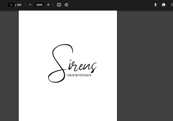
This led to me having to ask the artist who made my cover for a black-and-white png version of the title and my name so that I could upload it as a “Fullpage Image” on Atticus. Fortunately, the artist who made my cover is a close friend, so it was not difficult to get this worked out. However, if I had needed to hire someone for the cover who I didn’t know, this would’ve been an even bigger inconvenience.
So just be weary of this if you are also an author in the formatting stages looking for a platform to use. It might be worth getting a png version of your title and name from whoever is creating your cover right off the bat.
Finishing Formatting
In the end, I think that the formatting is something I can truly say I’m proud of. Even seeing the first few pdf copies made me realize that this story is becoming more than a Word document, and it’s definitely sinking in that within a few weeks more than just my friends, family, and editor will be able to read Sirens. Hopefully, the hours I’ve put in with everything from writing to formatting will pay off.

One thought on “Finding the Right Format”